Interior Design Brand Identity & Environmental System
Role
Brand Identity, Creative Direction, Packaging and Print Design
The name "Cathedral" carries a lot of weight before anyone walks through the door.
Soaring ceilings, stone columns, quiet reverence. None of that belonged in the brand of a young, contemporary interior designer whose work is personal, current, and alive. The challenge was to keep what makes the name meaningful without dragging in all the baggage.
I reframed the word rather than fighting it. A cathedral isn't just a building. It's a space that people care deeply about, that reflects something about who they are and what they value. That's exactly what good interior design does.
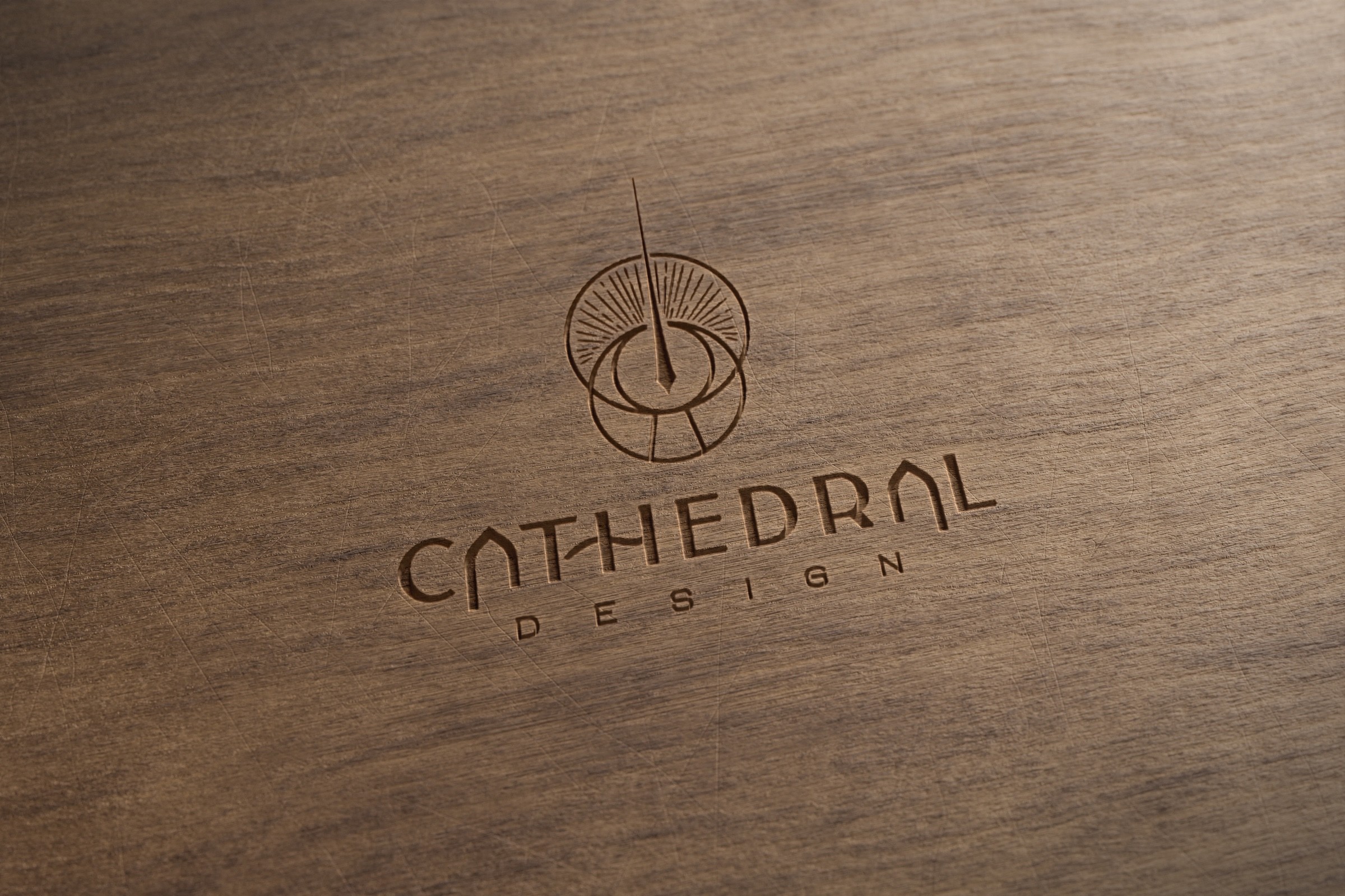
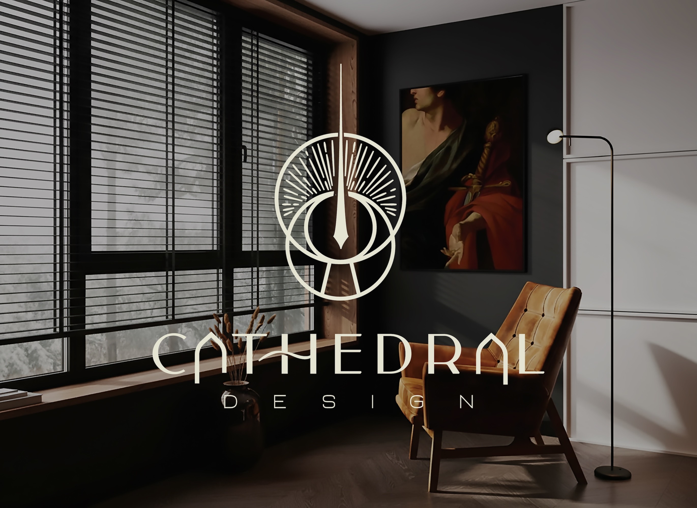
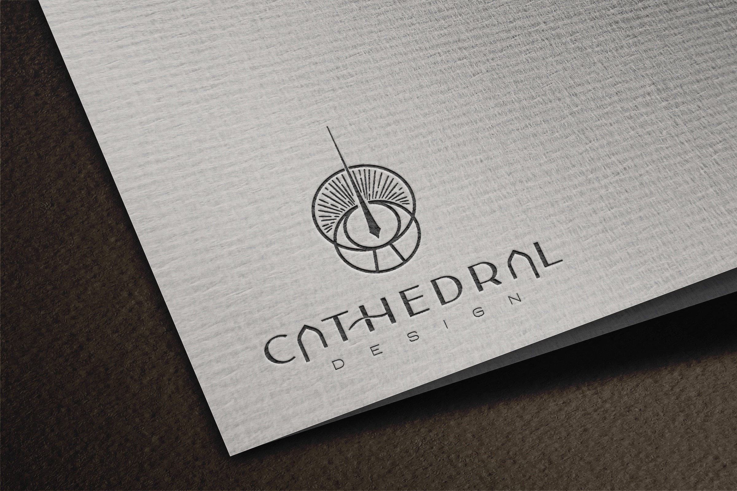
The logo combines a keyhole and eye motif with radiating light and an upward spire. It suggests discovery and perspective without announcing "architecture." The wordmark works in the same direction: a modern sans-serif that quietly folds arch forms into the letterforms.
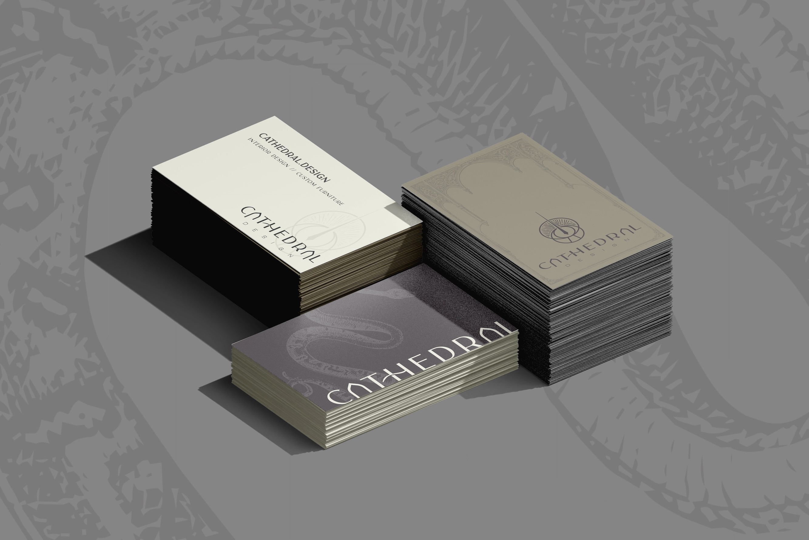
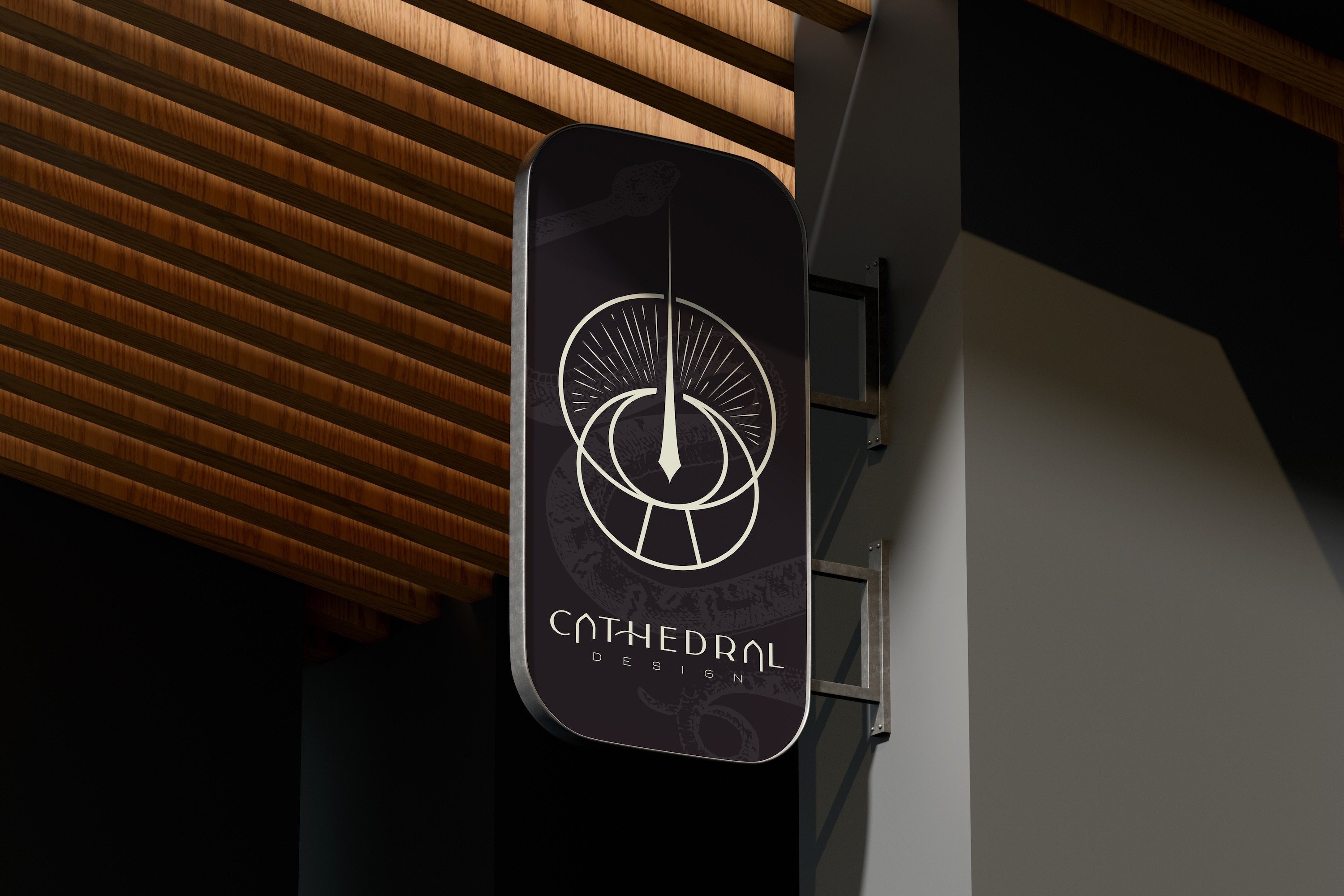
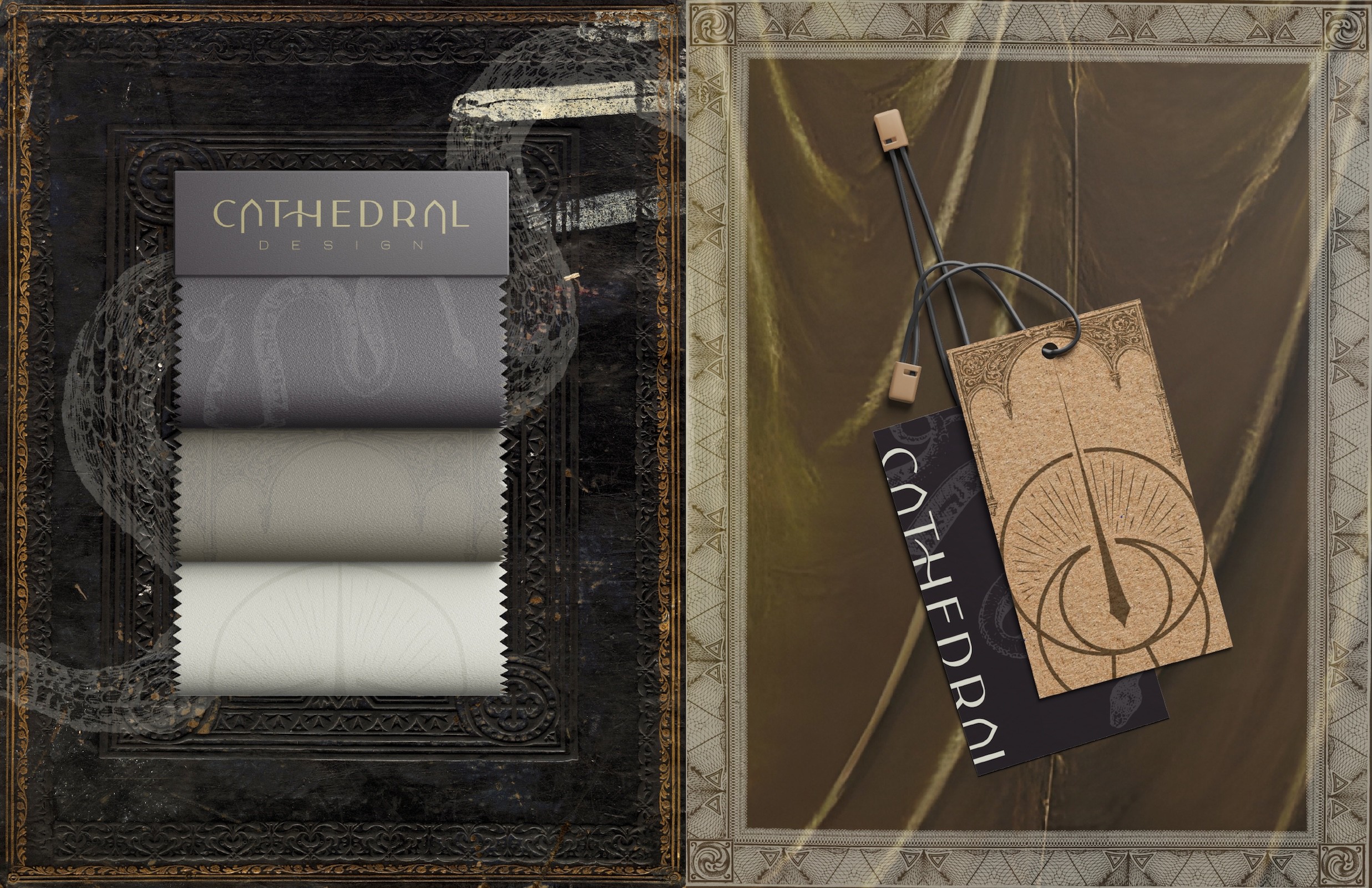
The palette is cream, deep green, and black. Sophisticated and warm. Gothic-inspired graphic overlays add texture and a sense of history without tipping into ornamental.
The system extends across stationery, furniture tags, swatch books, signage, and environmental graphics. Each piece holds the same tension between old and new.
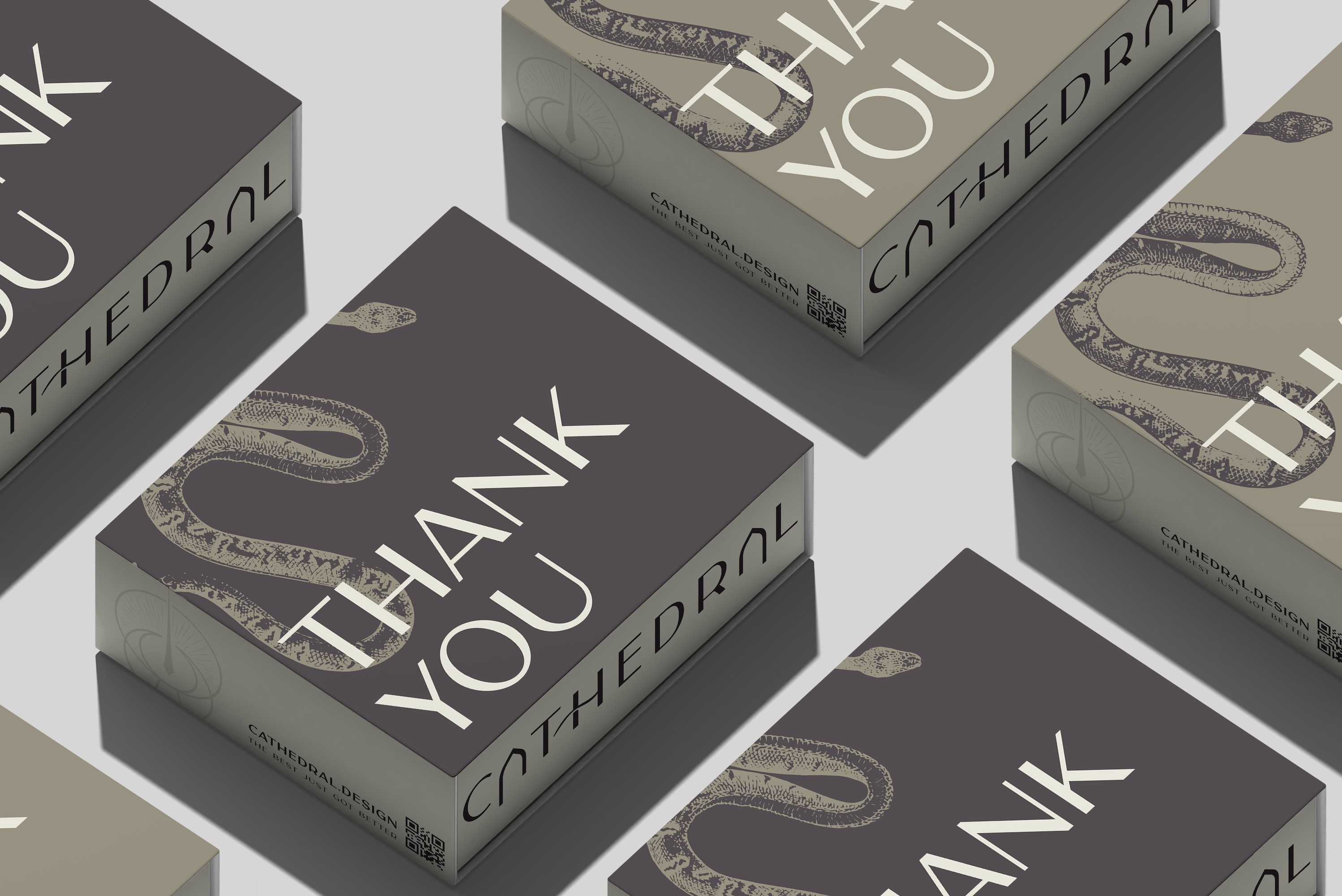
The identity feels like the designer behind it: someone with a clear point of view and the craft to back it up.
It honors the weight of the name while making it feel like it belongs to this decade. Clients aren't just hiring a service. They're choosing a perspective.