Culinary Nutrition Brand Identity & Packaging
Role
Brand Identity, Creative Direction, Packaging Design, Photography Art Direction
The client works across five distinct disciplines: culinary nutrition, food science, regulatory consulting, one-to-one wellness work, and large-scale corporate partnerships.
Most brands would split that into two or just pick one to lead. The challenge was building something that could hold all of it without feeling scattered or generic. And it had to work at both scales: sitting across from a single client and presenting to a room full of executives.
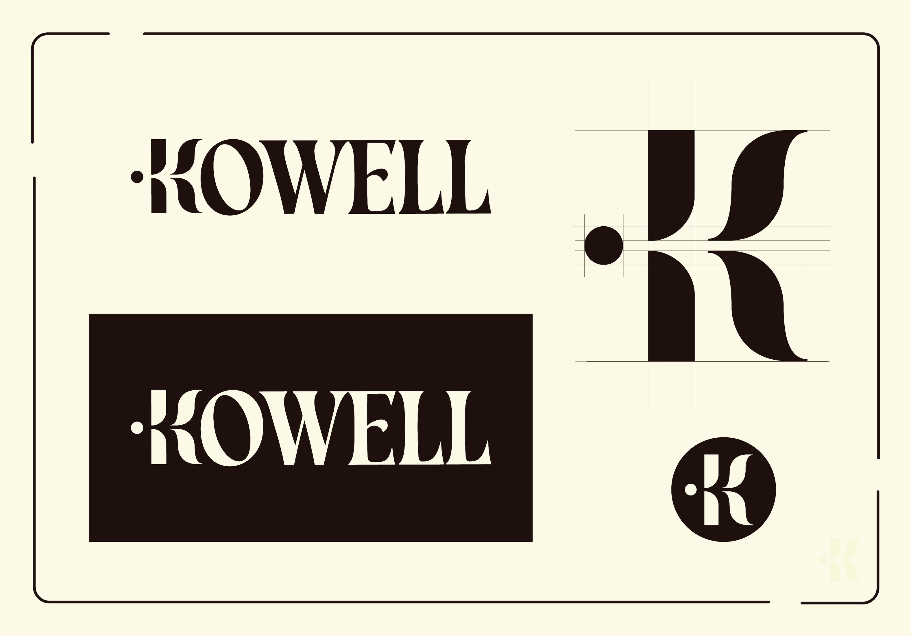
The KoWell mark is built from five unified forms, one for each discipline. They only work together. That's the point.
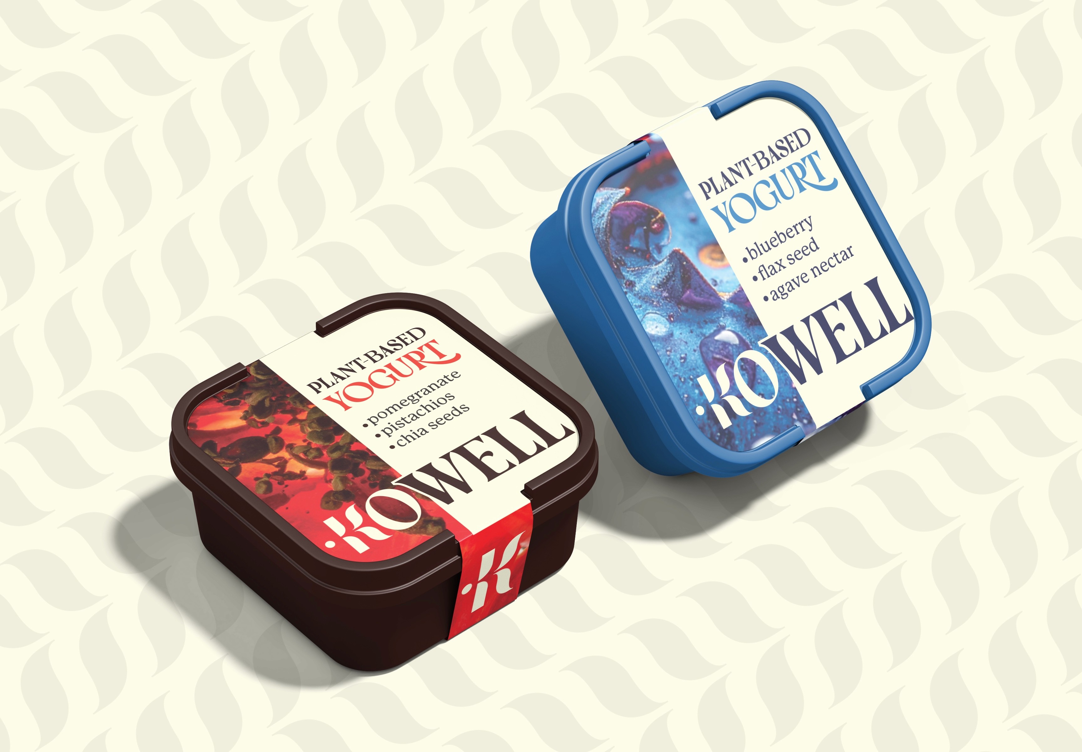
The identity system is designed to flex. The full wordmark anchors formal and professional contexts. A simplified icon extends naturally into packaging and digital. Warm neutrals and rich earth tones establish trust and approachability without losing credibility.
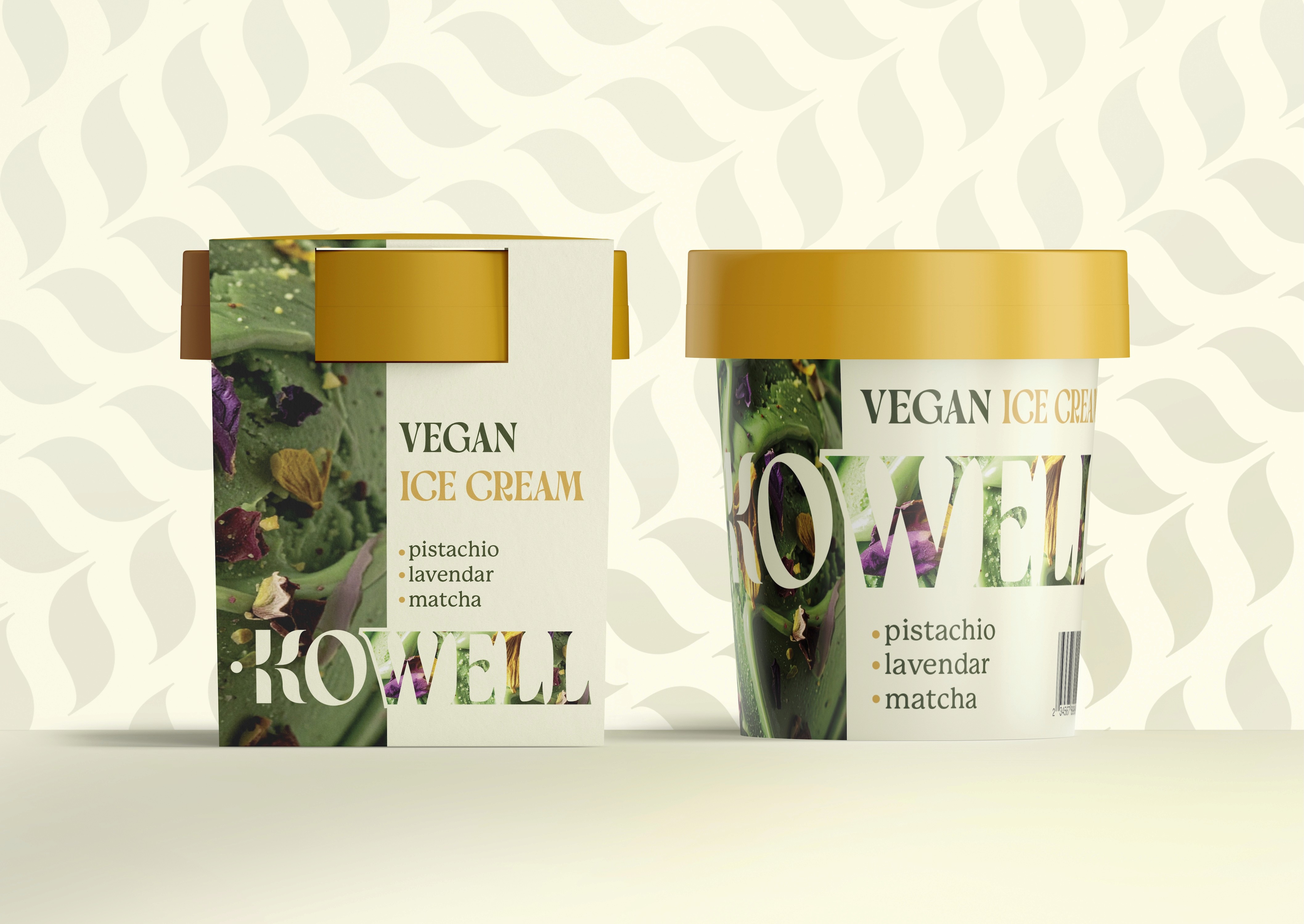
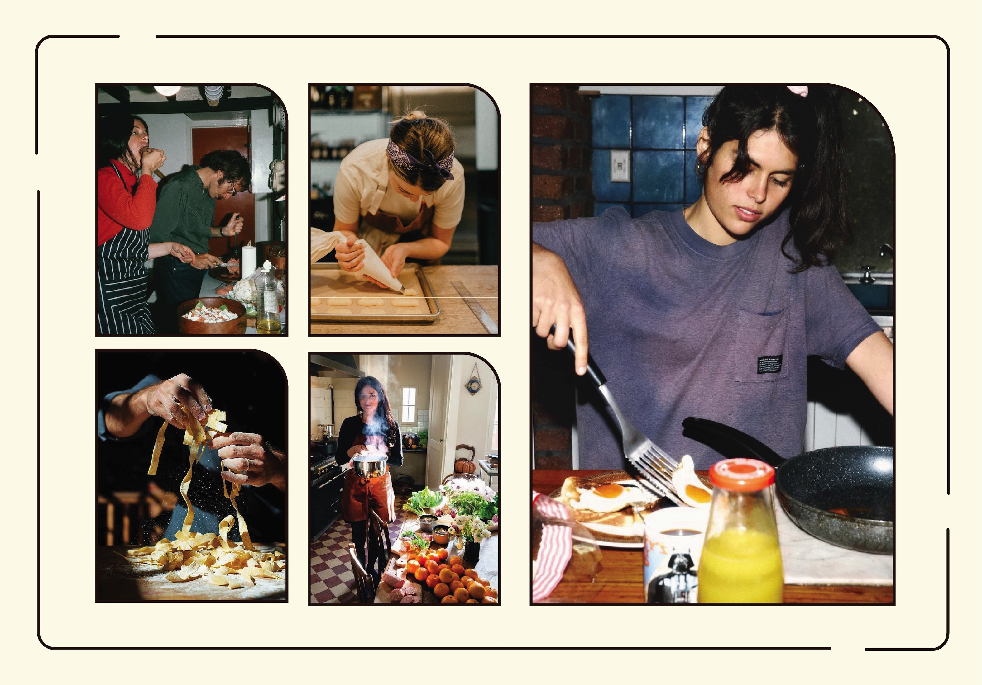
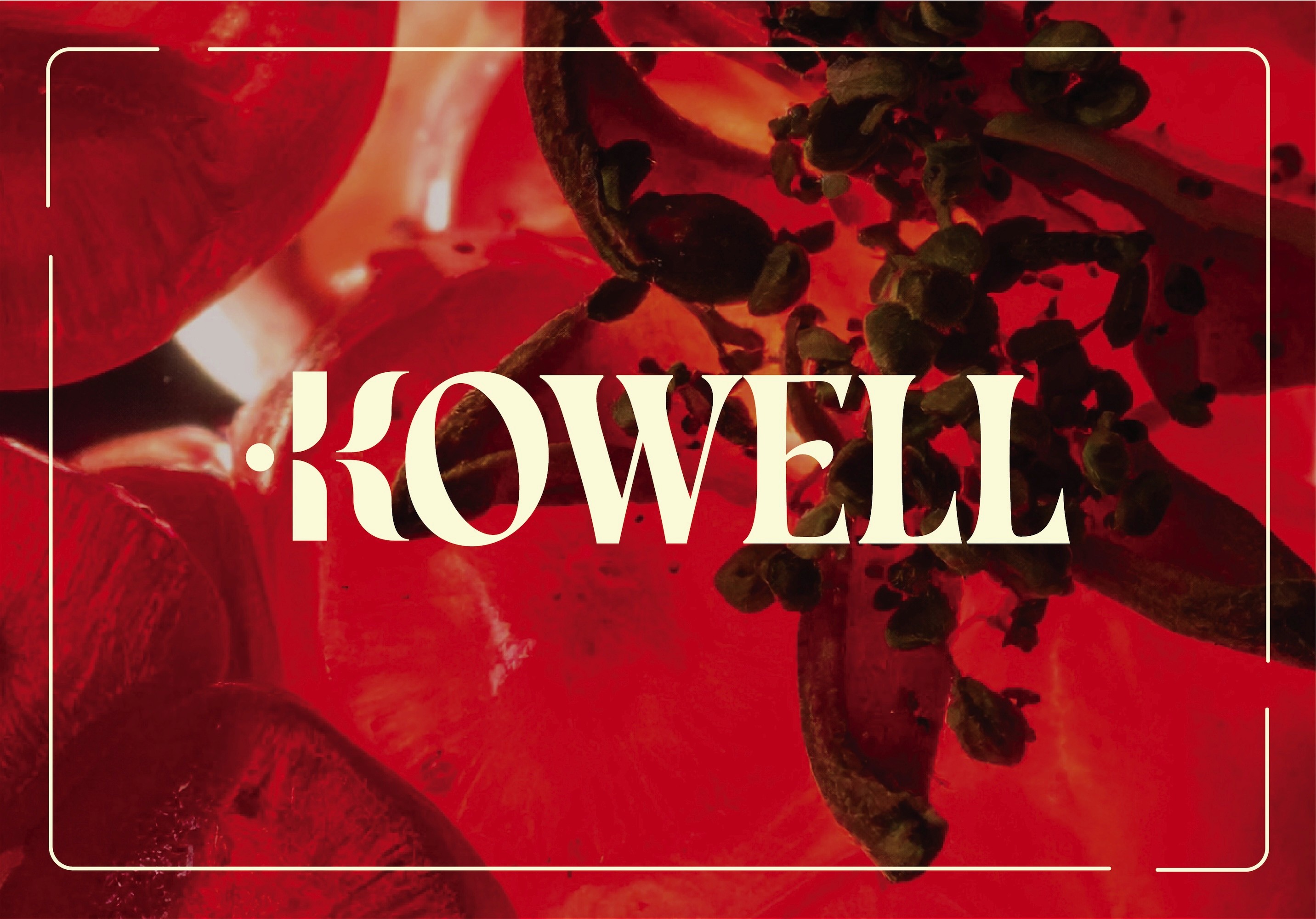
Photography does a lot of the work here. Close observational food shots emphasize texture, process, and discovery. They connect scientific precision with the tactile, human experience of actually cooking and eating.
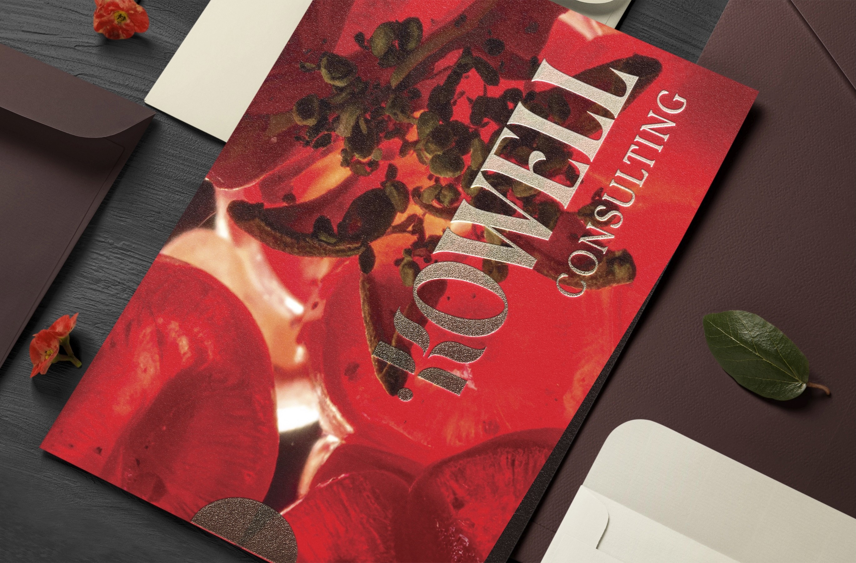
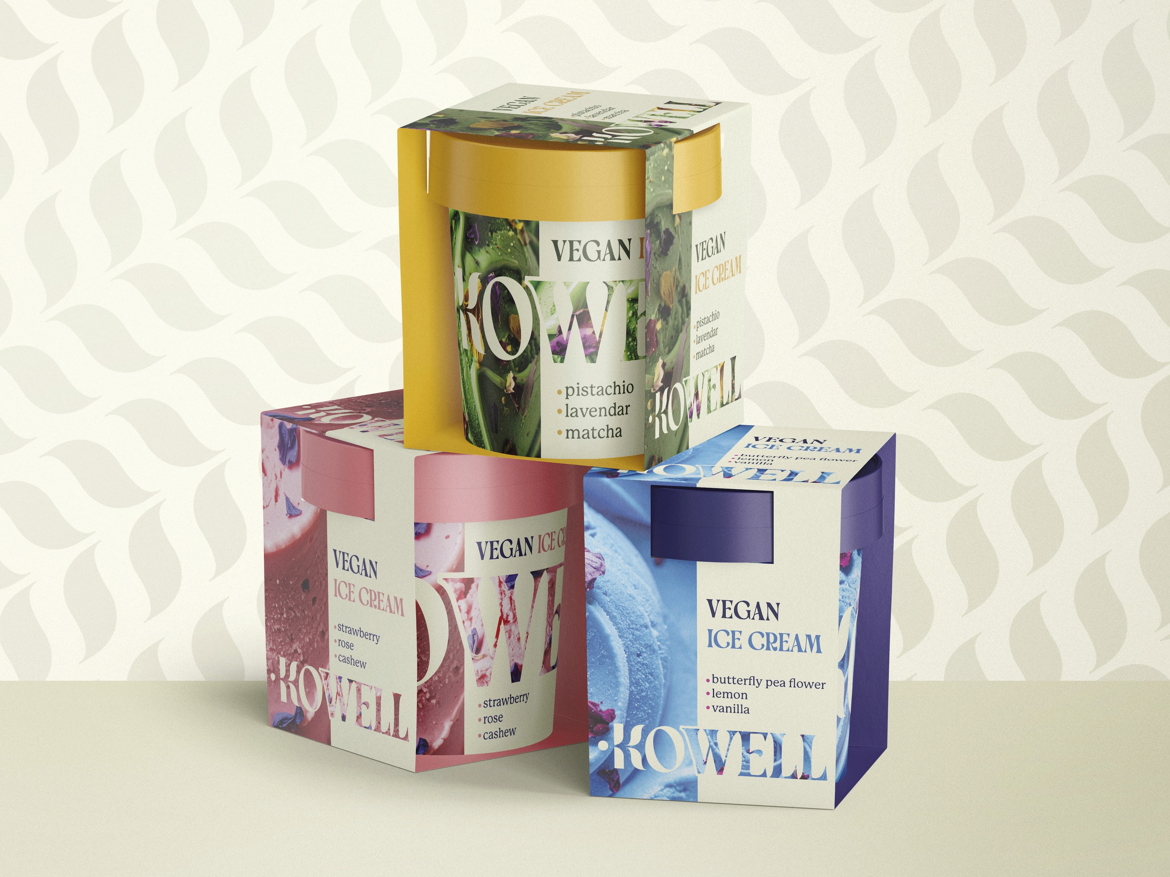
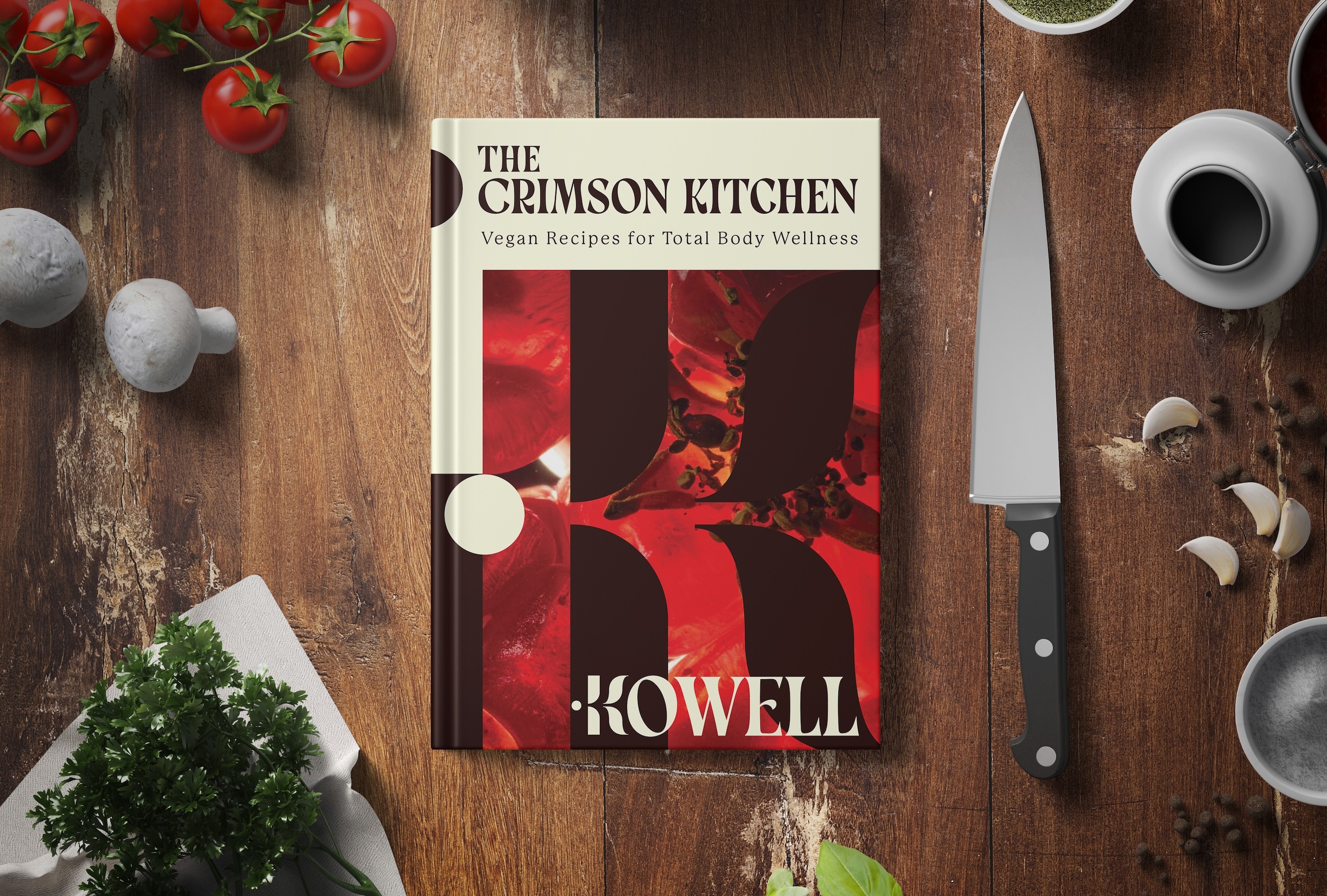
The brand can sit on a product label, a corporate deck, or a personal wellness card and feel right in each context.
It holds expertise without feeling cold, and warmth without feeling casual. For someone doing the kind of multidisciplinary work she does, that range isn't optional. It's the whole job.