Bouldering Brand Identity & Apparel System
Role
Brand Identity, Creative Direction, Illustration, Product and Packaging Design
Climbing has a branding problem.
Most outdoor gear looks the same: alpine peaks, earth tones, weathered type, and a general sense of wholesome adventure. It's clean. It's safe. And it misses the culture that actually shows up at the local crag.
The climbers in stinky gyms and dirty boulders aren't buying the commercialism and virtue-signaling being sold in a $500 jacket. They're grinding on highball beta problems in their stained jeans, scuffing their hands on sharp granite edges, and finding a tribe of misfits who love to grind as much as they do. The brand needed to reflect that.
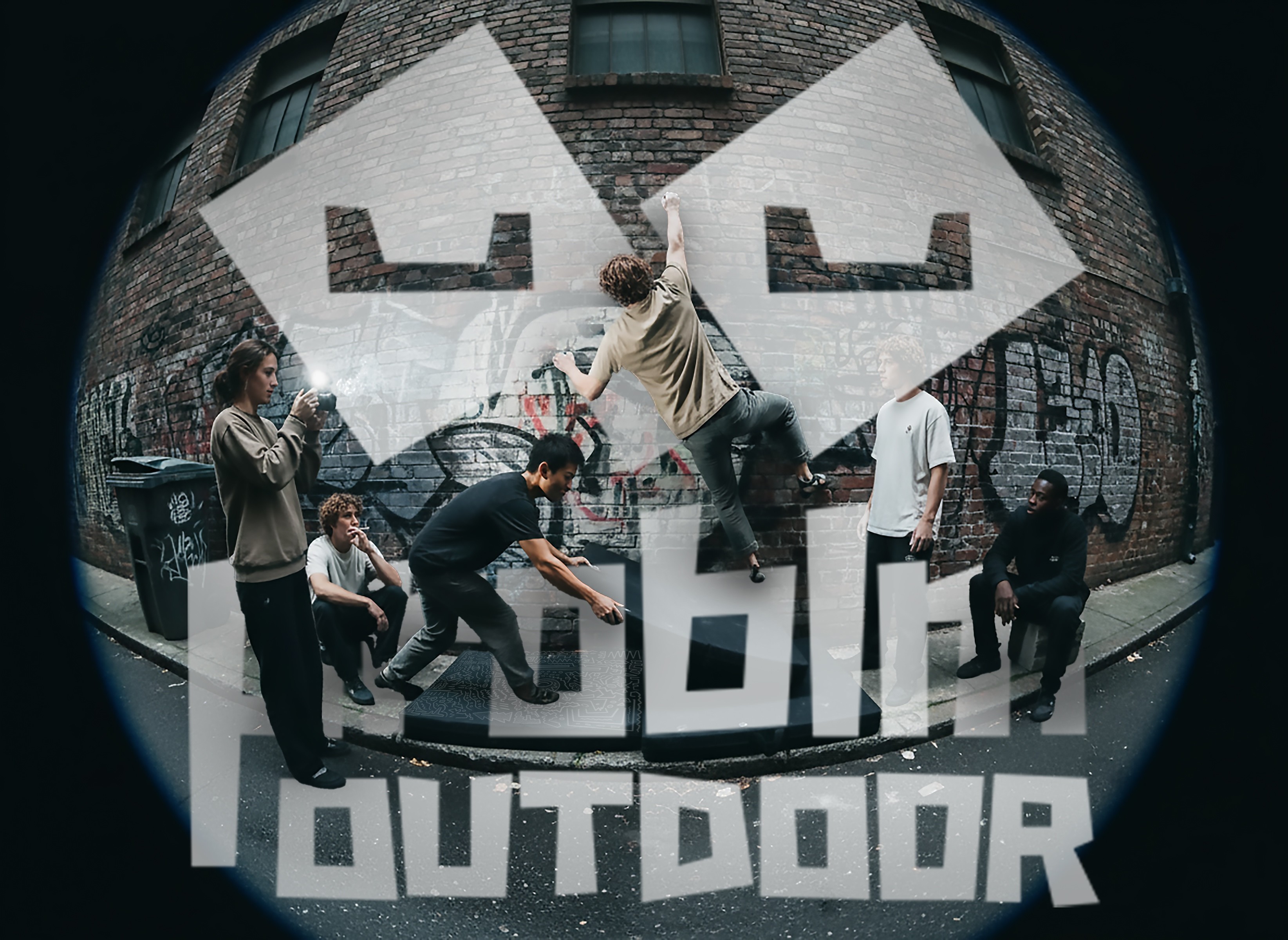
I pulled references from skate and underground youth culture instead of the outdoor industry. The name does double work: it nods to the climbing term for a route problem, and signals the attitude of the people solving them.
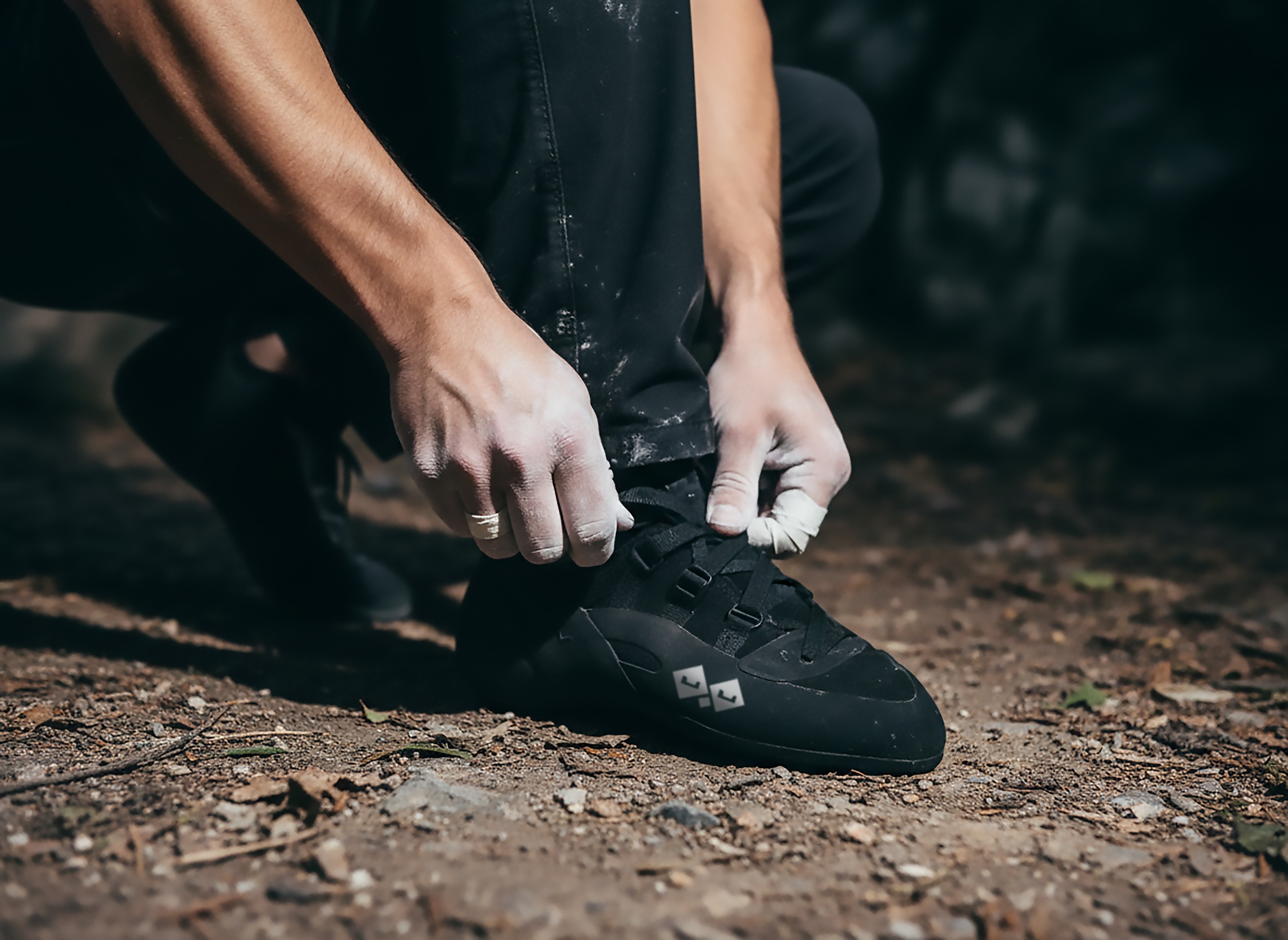
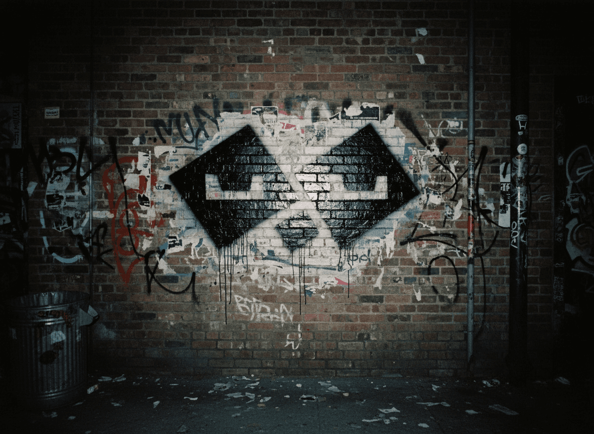
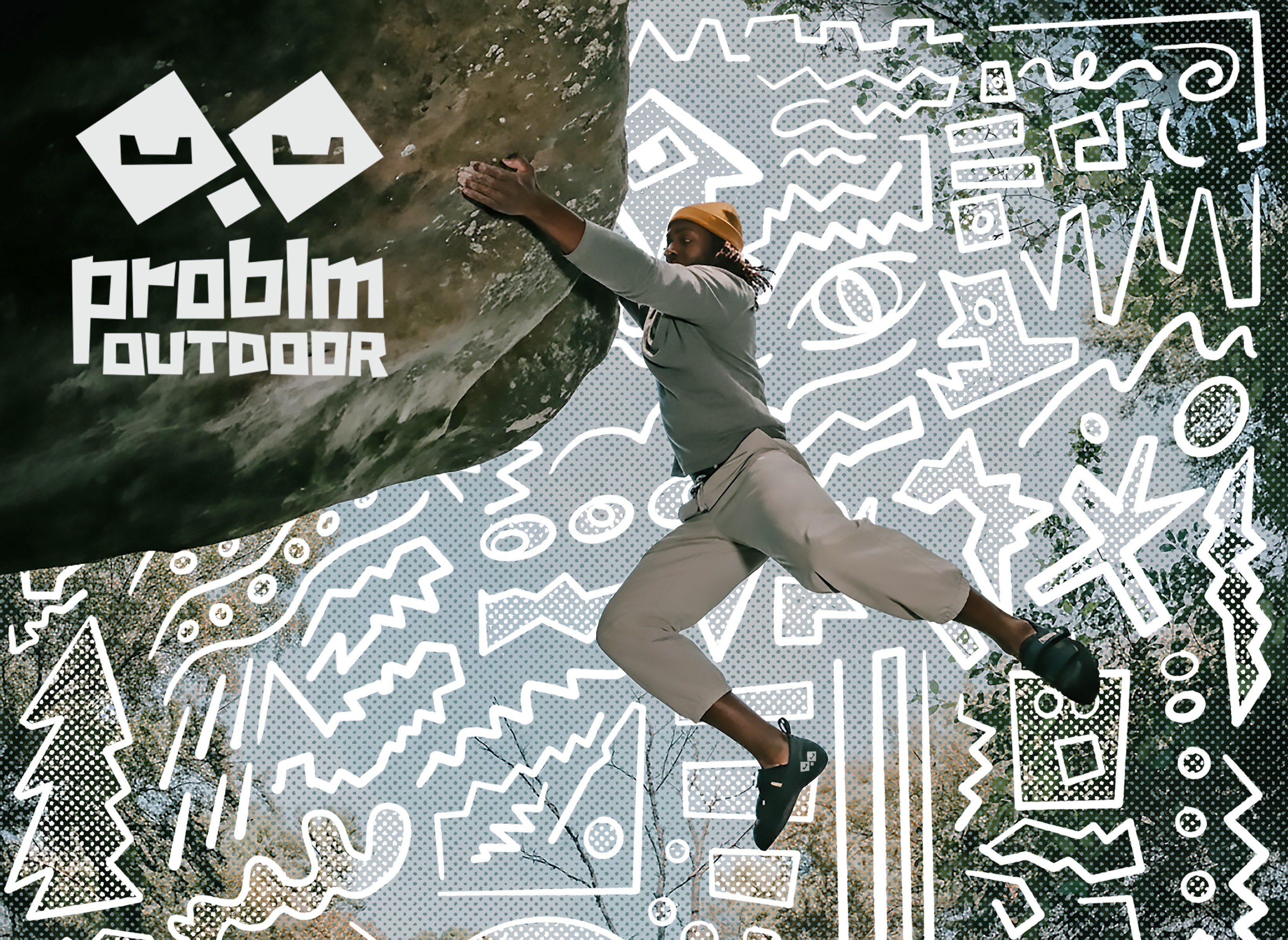
The primary mark turns a mountain silhouette into stacked boulders that read as a scowling face. It's subtle until it isn't. The visual system is mostly blackout: dark apparel with only the mark's eyes visible. It creates immediate recognition and a sense of belonging without needing to explain itself.
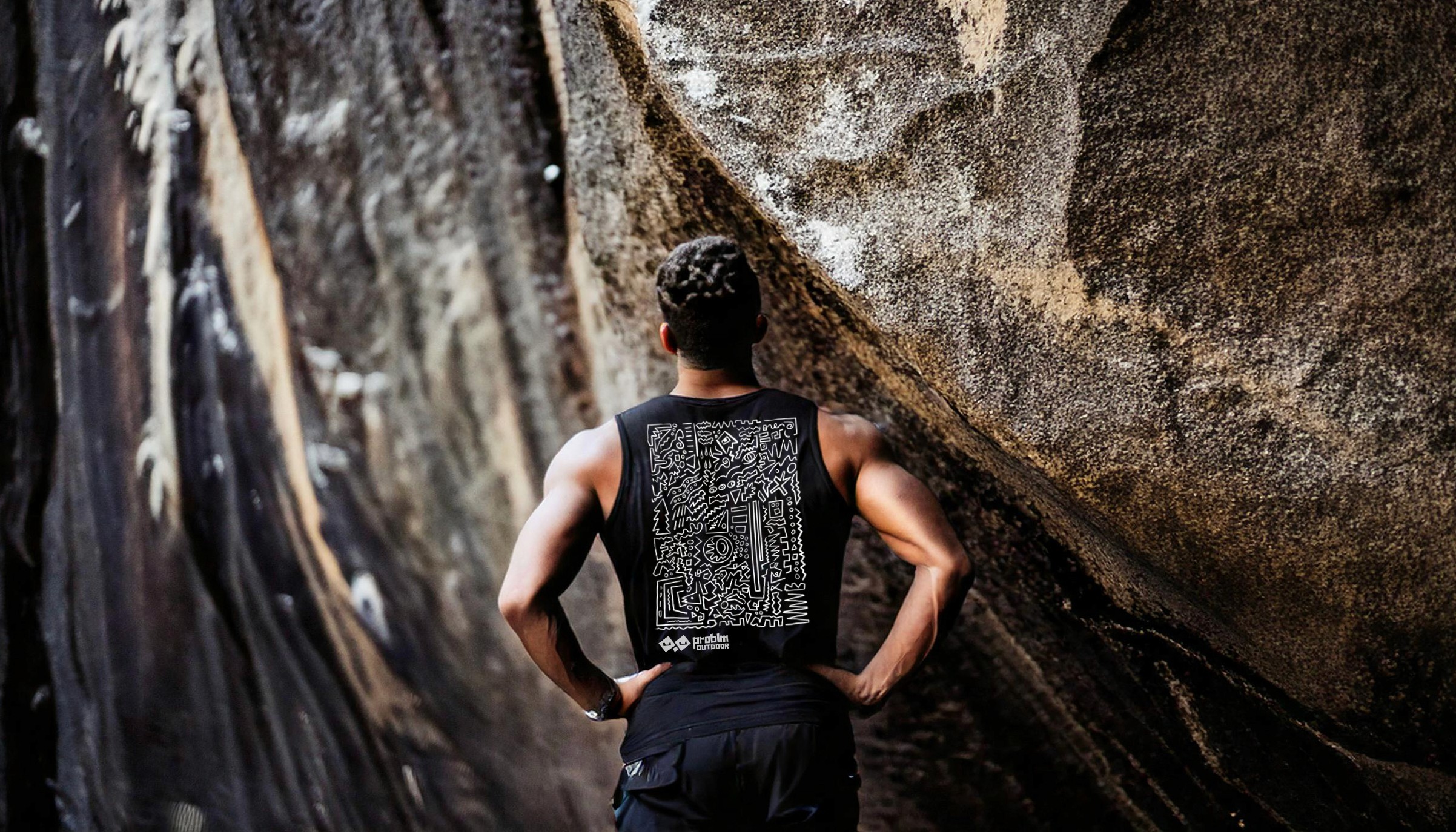

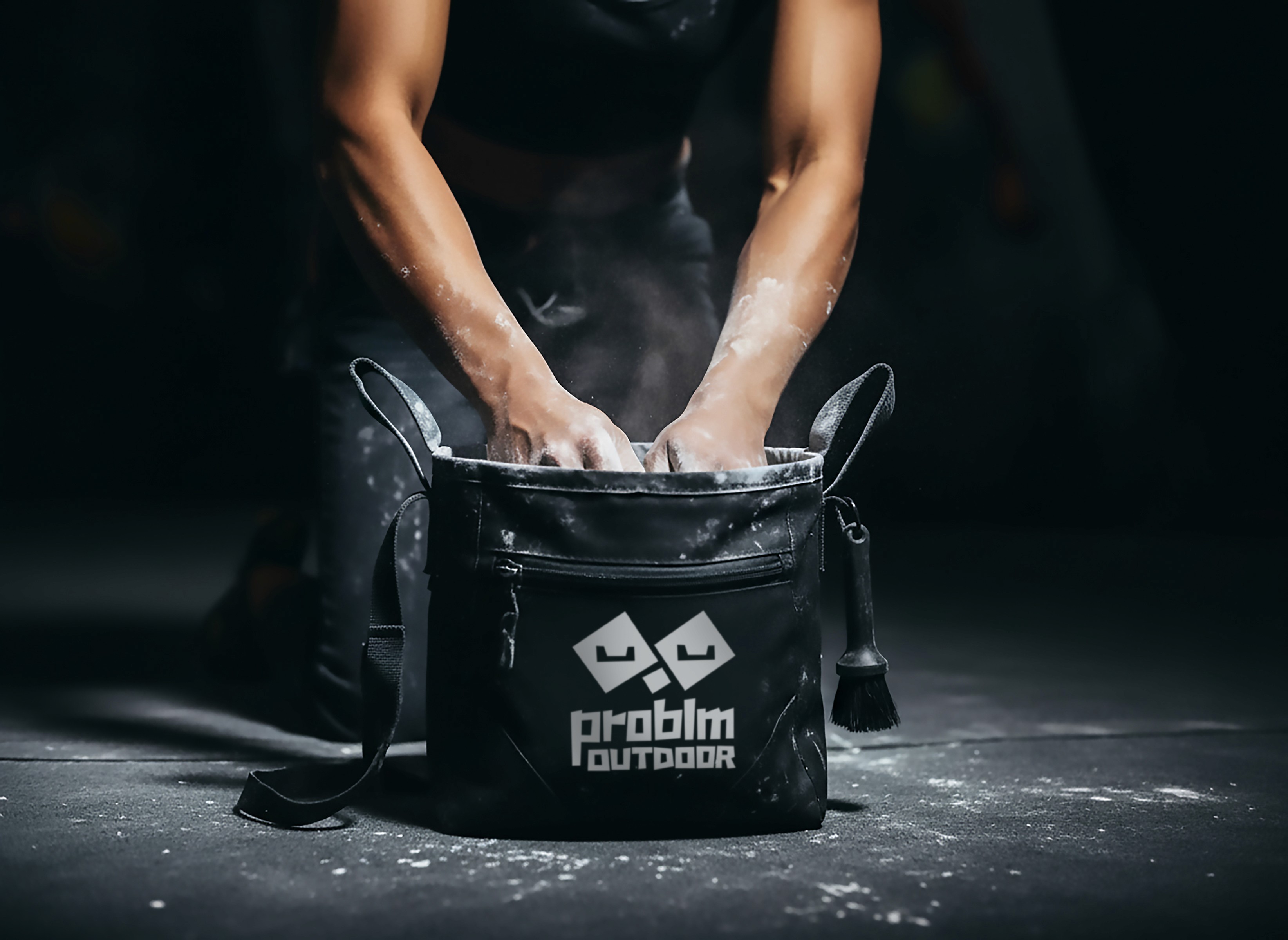
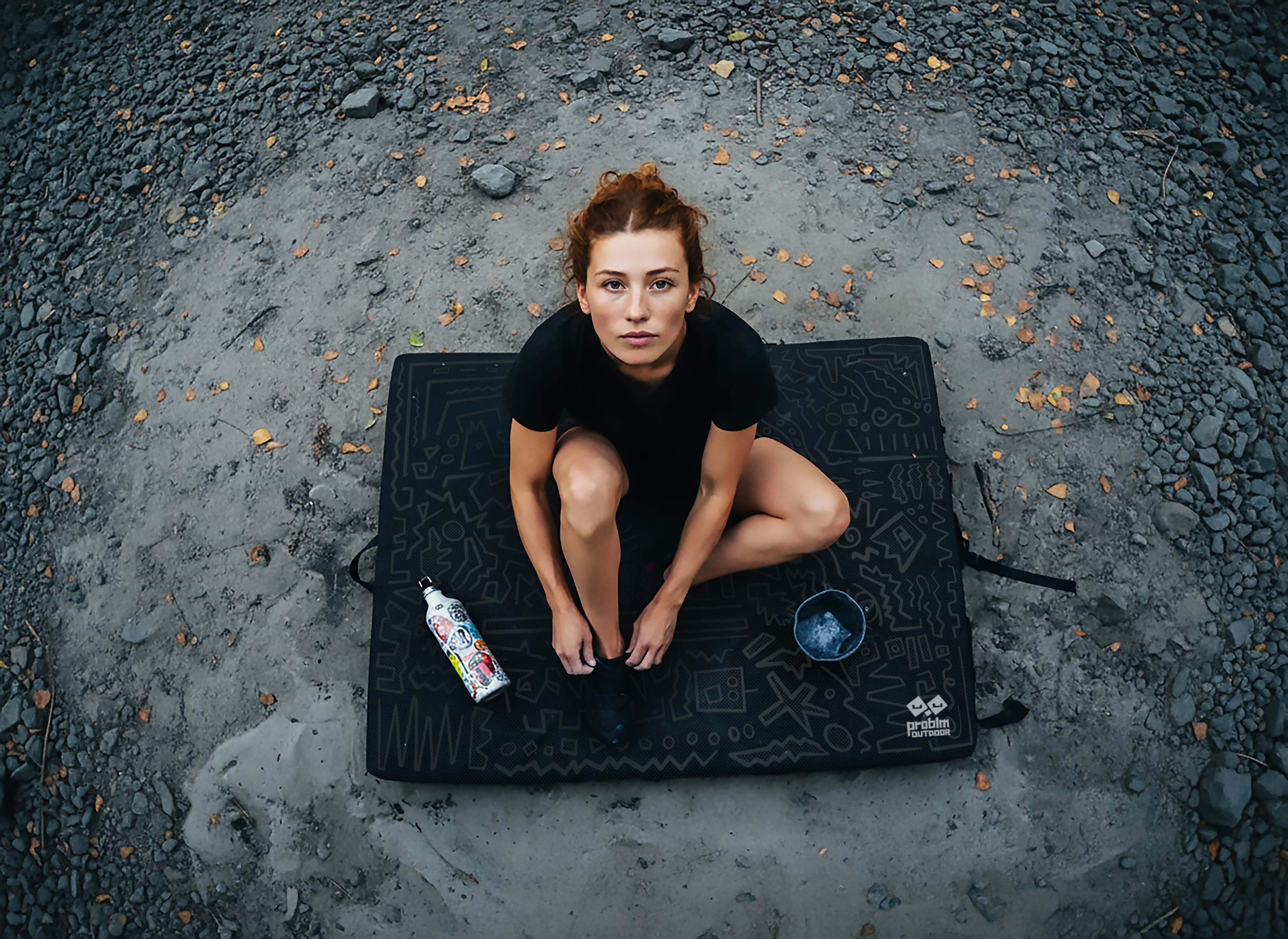
Supporting graphics use graffiti-influenced illustration applied across apparel, crash pads, and brand environments. Photography leans into flash, fisheye lenses, and raw urban textures. The whole thing contrasts hard against what polished outdoor brands look like.
Problm doesn't look like other climbing brands because it isn't trying to.
It speaks directly to climbers who already feel a little sideways of the mainstream outdoor industry. The identity gives that community a visual home without dressing it up or softening the edges.