Food Truck Brand Identity & Packaging System
Role
Brand Identity, Creative Direction, Illustration, Packaging & Environmental Design
Portland has seemingly hundreds of Mexican restaurants and food carts. Standing out in that market without leaning on generic cultural shorthand is harder than it sounds.
Most food cart branding defaults to Dia de los Muertos skulls, a sombrero, or a cactus. It's recognizable, but it's also forgettable. The goal was to honor Oaxacan heritage and family cooking in a way that felt specific, not borrowed.
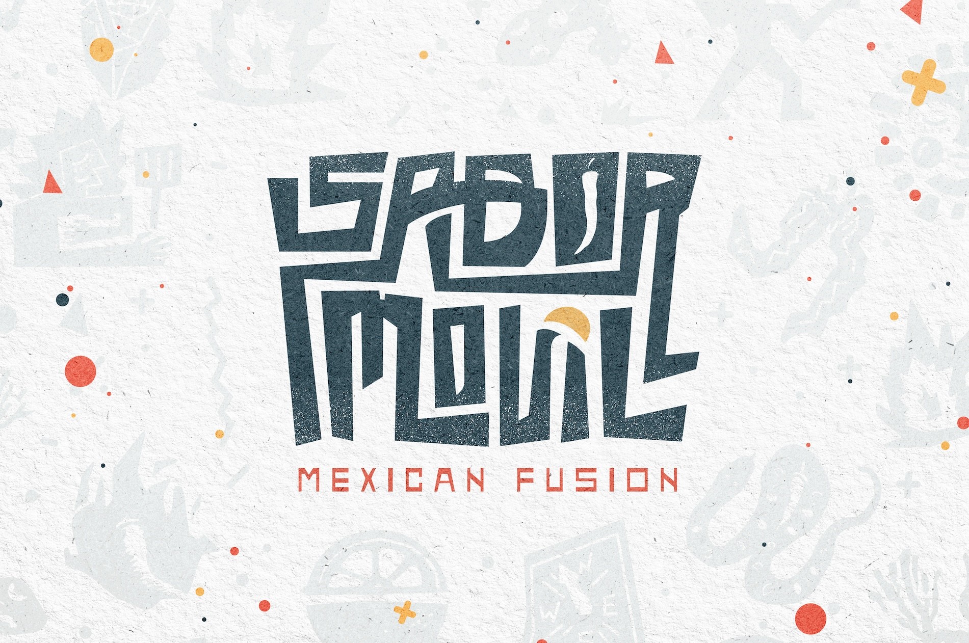
"Sabor Movil" translates to "mobile flavor". I started with wordmark logo packed with personality.
I eluded to mobility by creating a custom font where the legs of the letters extend and bend into pathways and connections. Within these roadways are easter eggs like a chile pepper and a juicy slice of lemon that act as destination points. The logo is then textured to give the grit and attitude of a flaming kitchen on wheels.
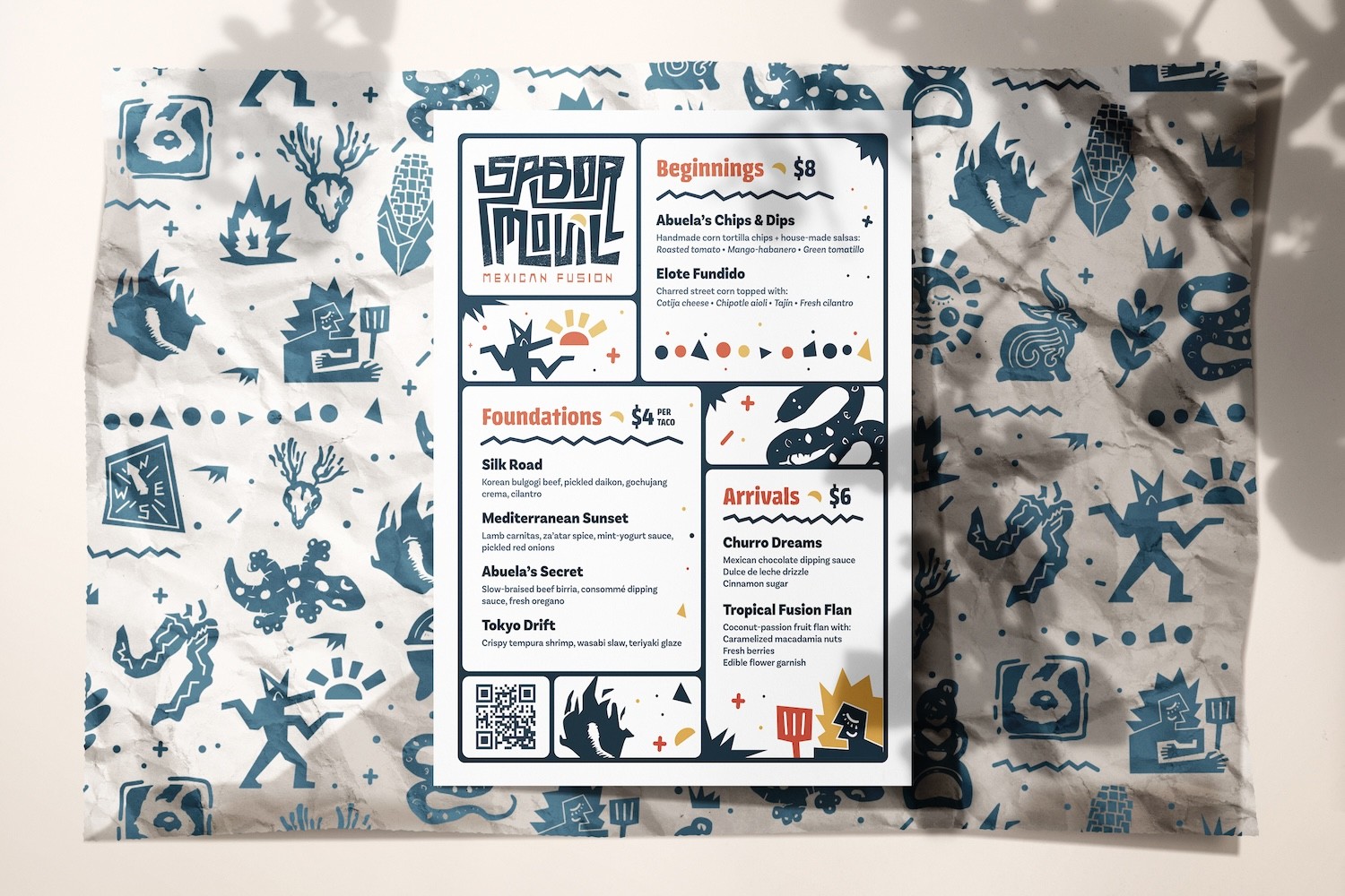

I built the identity around a flexible illustration system rooted in traditional iconography: chile peppers, coyotes, sun imagery, maize. These work as decorative collages, backdrops, and even main character iconography.
The palette is deep blue, burnt orange, and yellow on clean white. Enough contrast to read fast on a busy street, warm enough to feel like food worth stopping for.
The food truck design is bold, prominently featuring the Aztec god of music, dance, song, and mischief, Heuheucoyotl or "Old Coyote", happily holding a taco.


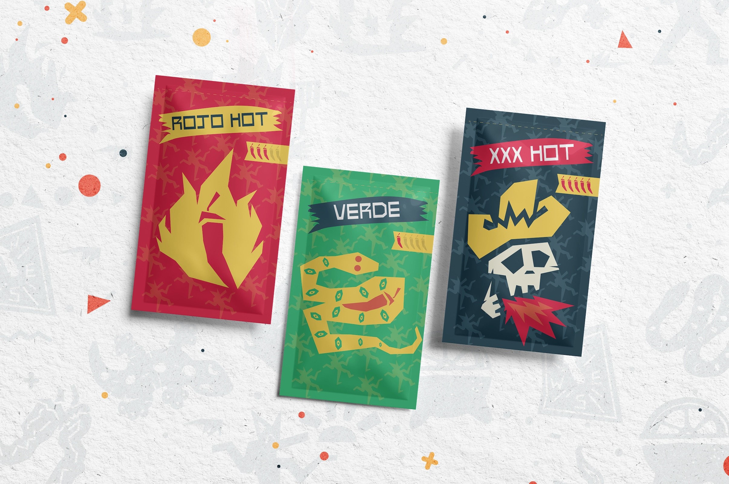
The system extends through every customer touchpoint: menus, taco trays, tissue paper, hot sauce packets. Each piece is designed so that even the smallest detail carries the brand forward
Everything is consistent enough to feel like a commercial brand yet personal enough to feel like it came from somewhere authentic and familiar like abuela's kitchen.
