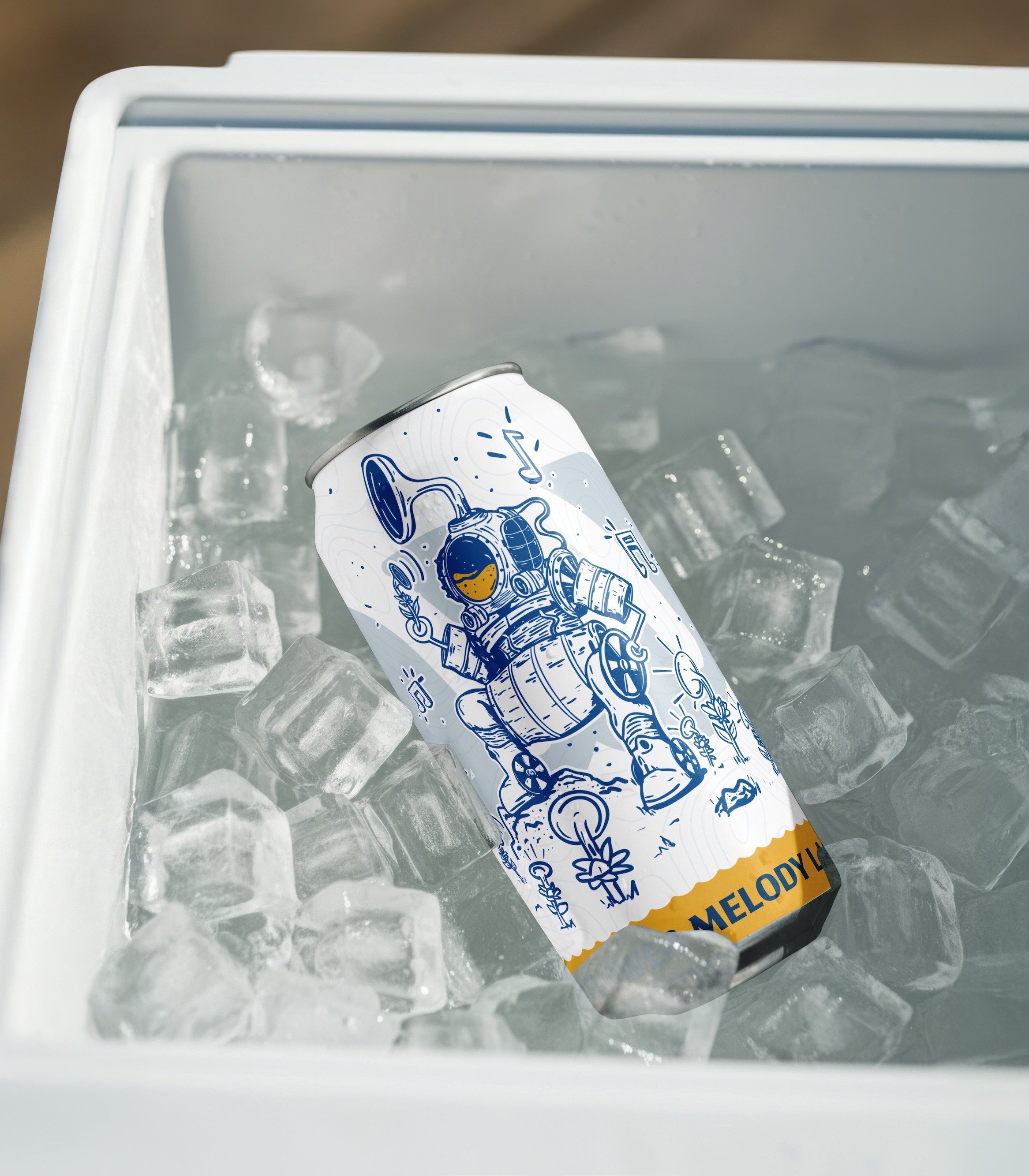
Craft Brewery Brand Identity & Packaging System
Role
Brand Identity, Creative Direction, Illustration, Packaging Design, Merchandise & Environmental Applications
Watershed started with a constraint: avoid the usual craft beer clichés.
Most regional beer brands lean hard on mountains, rivers, and hand-drawn badges. It’s familiar, but it all blends together. The goal here was to create something that still felt rooted in place without relying on those signals.
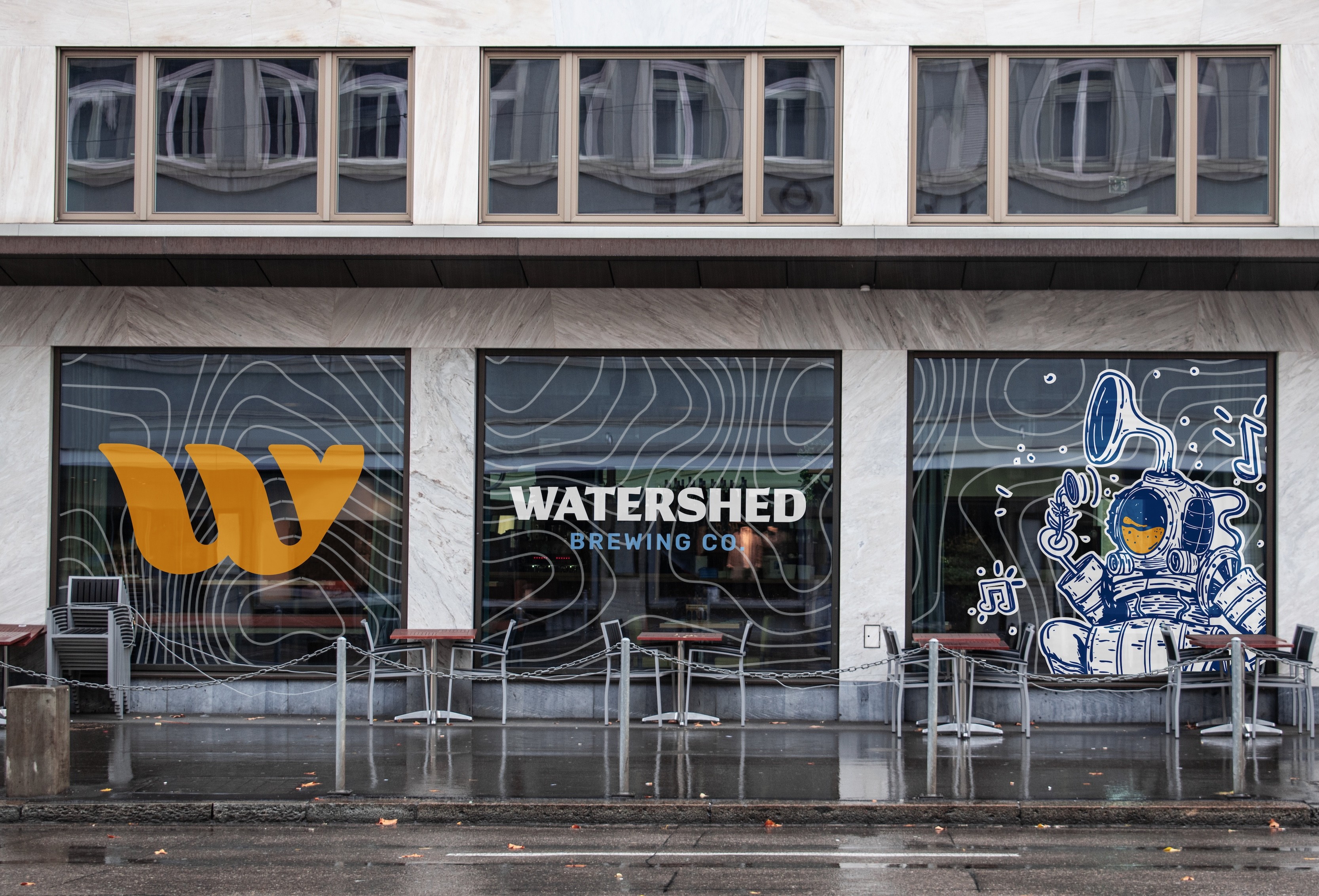
Instead of building the identity around hops or nostalgia, I focused on character illustration and storytelling.
I created a world for beer lovers to get immersed in which follows a recurring main character (the KegMan Diver) as they explore the depths of an otherworldly ocean with curiosity and childlike wonder.
The ornate illustrations are grounded in a brand mark "w" shaped in the silhouette of a whale that is strong, bold, and consistent. This links a recognizable, unchanging symbol with a fresh and shifting illustration.
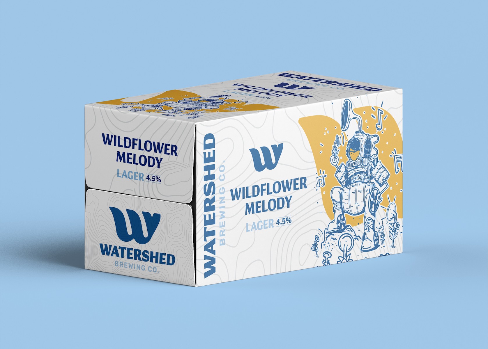
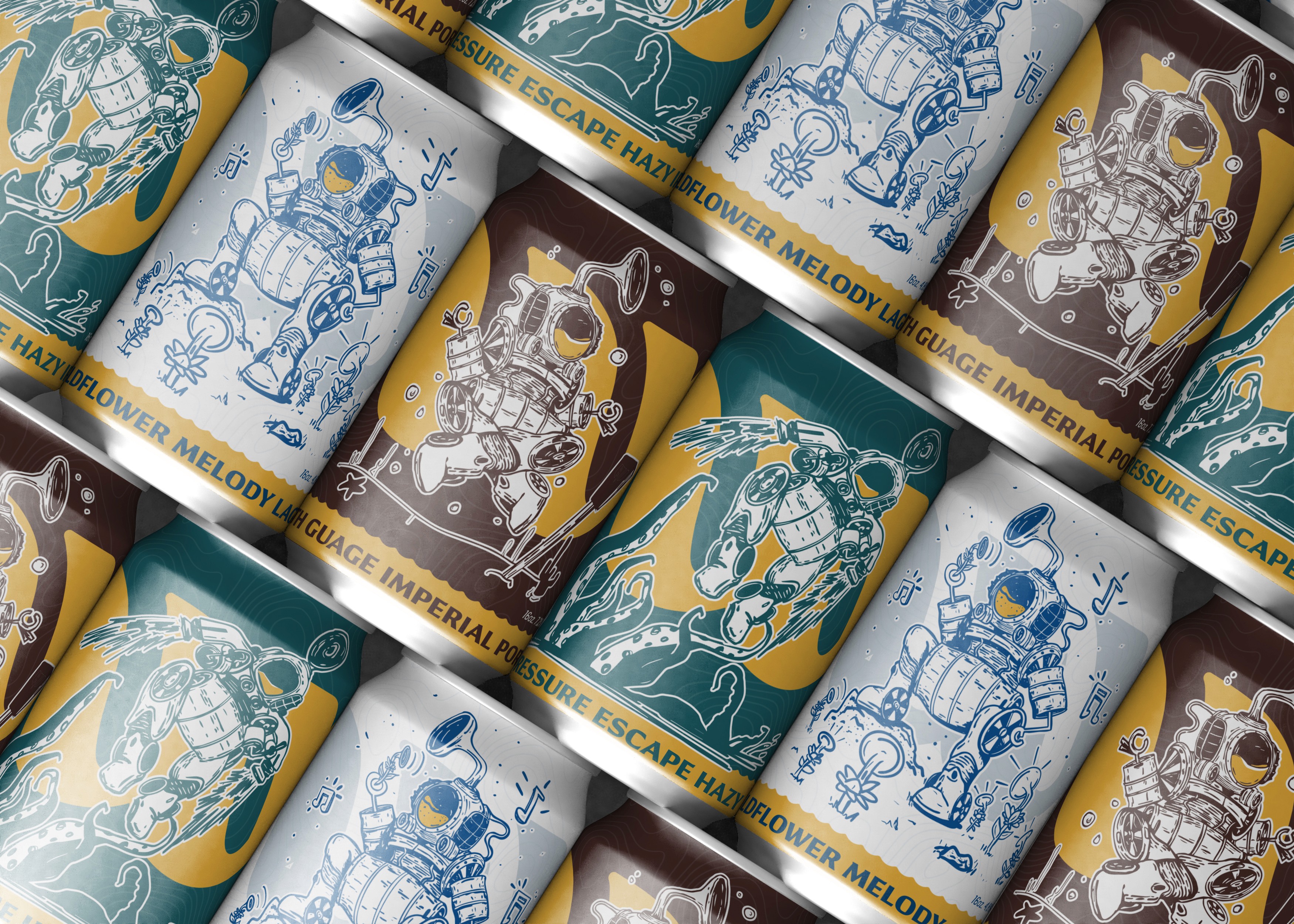
The packaging is built to flex.
Each beer variation is grounded by the same underlying framework while featuring a fresh KegMan Diver illustration and color shift. This keeps the lineup cohesive on shelf, but still gives each product its own identity.
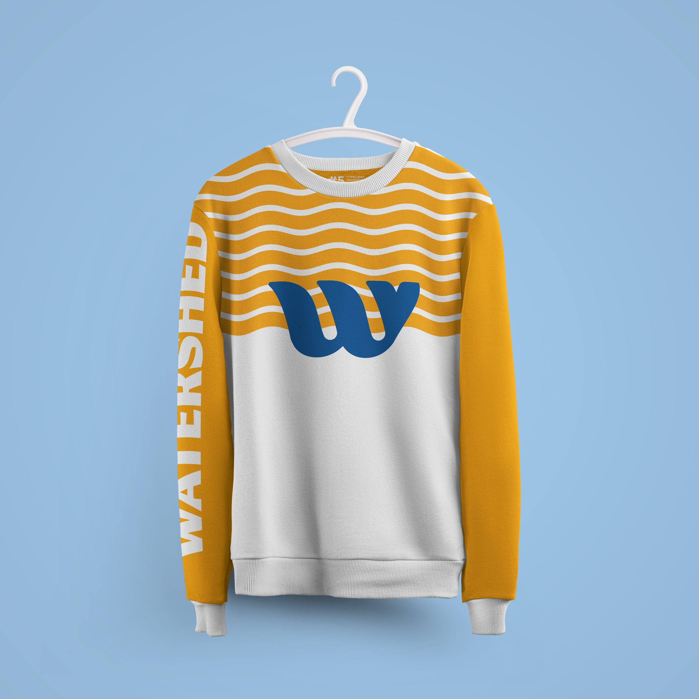
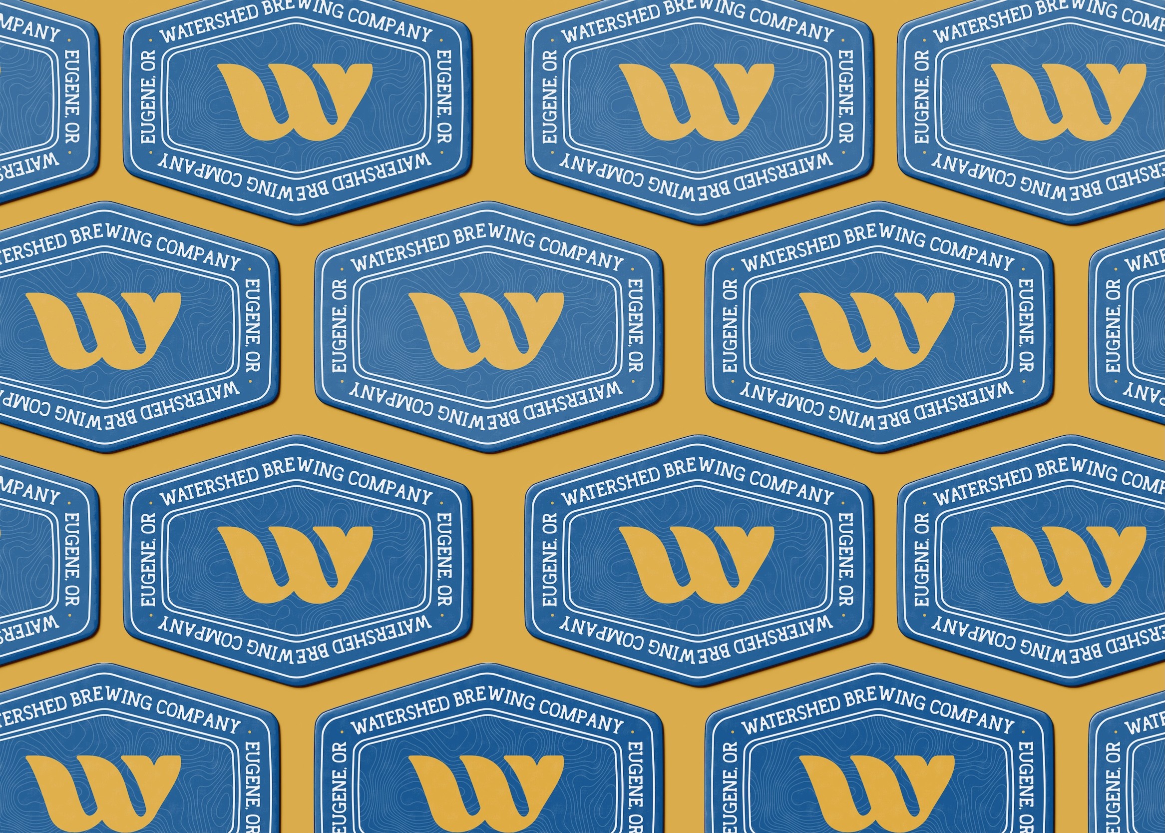
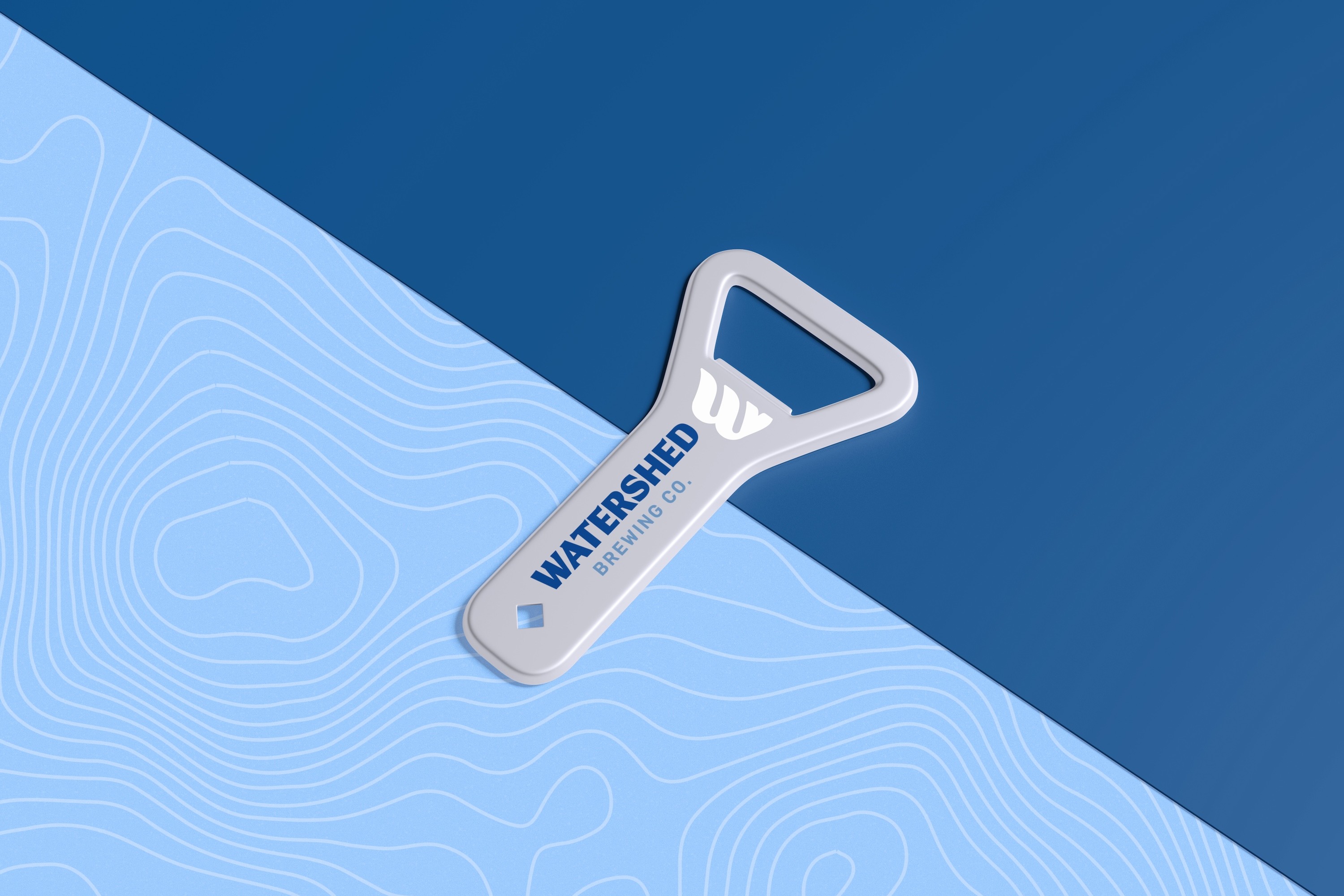
The merchandise and collateral were designed to be more subdued in their illustration. They feature the strong brand mark and bright color palette while to giving subtle nods to the ocean waves.
The result is a quietly recognizable brand identity in a loud market.
It doesn’t fight for attention with complexity. It builds a habitat for the consumer to explore and follow along with the story.